![[Home]](../../images/buttons/but-home.gif)
![[About]](../../images/buttons/but-about.gif)
![[Art]](../../images/buttons/but-art.gif)
![[Links]](../../images/buttons/but-links.gif)
![[Junk]](../../images/buttons/but-junk-sel.gif)
![[Map]](../../images/buttons/but-map.gif)
Stick Boy's Home Page
About ·
Art ·
Links ·
Junk ·
Map
Junk » Informal Reviews »
D-Link's USB FM Radio v6.0 software review
- Introductory Rant
- Installation
- The Radio Application, main view
- The Radio Application, minimized view
Meta-reviews - Conclusions
Introductory Rant
I've been meaning to review this software for almost a year.
I normally don't review products
In particular, a number of other reviews actually have positive comments
about
A reviewer wouldn't even need to be trained in user interface design to
know that there are clear, immediate usability problems with
(I'm going to concentrate entirely on the software that
Installation
From the very beginning I knew the radio software would be poor, since even the installer had usability issues.
Analysis of a screenshot from the installer:
Non-standard buttons
Whether or not icons on buttons is a good idea or not, it's not standard. A simple Windows program such as an installer should follow Windows interface guidelines. Period.- Colored text
Unnecessary. Blue text is hard to read, and users now tend to associate blue text with hyperlinks. The magenta text at the bottom has poor contrast against the gray background and is even harder to read. Simple bold text would have been sufficient. Non-standard installation directory
Again, by default, Windows programs should install to a subdirectory of Program Files. Worse yet, there is no browse button to select a different directory; selecting a different directory requires typing its path manually.
To be fair, the installation was otherwise fairly simple and straightforward.
The Radio Application, main view
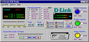
The foremost problem is that
Dials
Dials are not appropriate interface widgets for mouse-based interaction. You don't need to be a usability expert to know that software dials are a bad idea.Three volume controls
Being familiar with Windows, I understand the differences among the different volume controls. However, most users should not need to be exposed to these differences. Power buttons
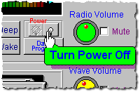
I haven't the slightest idea why radio software needs a power button. In this case, the software has two: a "Power Off" button and a "Power On" button. Also note thenon-standard tooltip.Poor button placement
The rewind and fast-forward buttons for the sound recorder/player are arranged in reverse-order from convention. The "Edit" and "Store" buttons should be coupled more tightly to the presets.No keyboard controls
Being able to type in a station frequency seems pretty natural and obvious to me. Useless tuner slider
The slider is too small and the sensitivity is too great to be able to tune to a specific frequency quickly and accurately. Does it really need precision to five hundredths? Again, being able to type in a frequency would be more useful.Using it to station surf might have a few uses, but unfortunately the radio tunes to a station only after you release the mouse button, not while you're dragging.
Excessive number of presets
D-Link's software stores a whopping 200 presets. Wow! This is not an upper limit; it is a fixed number. Whether you use them or not, all presets come preprogrammed (to seemingly random frequencies).Even with the unrealistic assumption that every tenth of a MHz tunes to a unique radio station, there can be only 211 stations at most in the radio's FM range (87.0 Mhz to 108.0 MHz). A more realistic upper bound would be a quarter of this number. Apparently
D-Link preferred overkill to allowing the software to store an arbitrary number of presets based on each user's own particular needs.
[Edit: The FCC allots each FM radio station 200 KHz of bandwidth. This reduces the upper bound down to 106 stations.]To manage this mind-numbingly large number of presets,
D-Link chose to divide them into 20 groups, with 10 presets per group. Only one group is visible at a time. The user can select the previous or the next group but cannot jump to a specific group. Regardless of the selected group, the visible presets always are numbered1-10 . This is a little confusing, since it's not obvious how to determine which group is selected. Can you find it? In the main display, next to the station frequency, above the MHz label, is the group: ST1. ST1 is a poor abbreviation; I typically associate "ST" with "Stereo", and only in retrospect can I assume that it really stands for "Set 1". The label is positioned poorly, which only exacerbates the confusion. If placed elsewhere, there also would be more room for the text, eliminating the need for the abbreviation.I would prefer group 1 to have presets
1-10 , group 2 to have presets11-20 , etc.. With this numbering, it would be obvious which group currently is selected.This may be moot, since 10 presets may be sufficient for most people.
Inflexible presets
One advantage of a software-based radio interface is that it should be trivial for a user to change the order of the presets. Unfortunately,D-Link's software does not allow this.Useless cassette deck graphic
Clicking on the cassette deck graphic displays a small graph of disk space available for recording in its place. The correlation between a cassette and free disk space is weak at best, and I see no reason why they couldn't replace it with the disk space graph permanently. Again, this is an attempt to copy a physical interface that has no purpose in anon-physical interface.Nearly incomprehensible icons
Why does the store preset icon show a document going to a floppy disk? What document? A solitary floppy disk icon would have been more suitable; the lone floppy icon already is commonly used to signify saving, and eliminating the document and arrow would have allowed the floppy icon to be larger and more recognizable. The sleep and wake icons are too similar to distinguish quickly.Lots of blue text that aren't hyperlinks
Look-and-feel
The whole look-and-feel of the application is reminiscent of bad, unprofessional Windows 3.1 applications.Poor use of screen real-estate
Screen real estate is wasted to a gratuitousD-Link logo. The customer already bought the radio and is using your software, do they really need to remind him who the manufacturer is? (And perhaps more importantly, do they really want to take credit for this software?)
The Radio Application, minimized view
When minimized,
The minimized view.
Minimized view cannot be dismissed
The minimized view is obtrusive; it always appears on top of other windows. This behavior cannot be disabled. Futhermore, the minimized view cannot be minimized to the taskbar. This means that there is no way to removeD-Link's radio application window from the desktop; the user either is forced either to use the main view (which fortunately can be covered by other windows) or to have the minimized view floating on the screen.(
D-Link's software actually does allow the user to dismiss its windows completely; the user must quit the radio application. The radio continues to play after the application terminates. This behavior is hardly intuitive.)Completely incomprehensible icons
The buttons are just too small to identify without tooltips.Poor use of screen real-estate
Even in this minimized view, where the graphical elements should be kept to a bare minimum,D-Link squanders highly valuable screen real-estate with a gratuitous logo.Furthermore, in this minimized view, is the user really concerned about details such as whether the station is broadcasting in stereo?
Even poorer use of screen real-estate
Aside from being able to mute the radio, the minimized view provides no functionality at all. Its sole purpose is to display the current station and a VU-meter. The user cannot tune to a different station in this mode, making this view virtually useless. This situation would be different if it accepted keyboard input, but alas...The idea is nice but is poorly implemented. In contrast, Winamp's title-bar mode is much more functional and less obtrusive.
D-Link would have been better off eliminating the minimized mode entirely and displaying the current station in the Windows taskbar instead.
Meta-reviews
The software used to control [the D-Link USB Radio] is laid out very well and is very intuitive. The full window looks pretty busy, but it is actually well thought out.--Overclockin.com
Exactly how much thinking does it require to copy a physical interface?
After installing the radio, we fired up the software and found it extremely easy to use.--3daccelerated.com
Would that opinion remain the same if the reviewer above weren't already familiar with physical radio controls?
Youll notice that all of the common features you find on standard radios are provided here as well... there's even a "Volume" indicator in the form of a dial!--rolotech.com
He says that like it's a good thing. Anyone who thinks a software dial is an appropriate widget deserves to be beaten with a clue-stick.
There's are [sic] 20 pre-set tables, so you get almost 200 channels of audio that you can conveniently switch between at the simple flick of a mouse...--rolotech.com
To get from one preset group to a random preset group will require 10 mouse-clicks on average. Isn't the purpose of using presets to reduce the amount of necessary interaction?
Conclusions
The software is barely adequate. It performs the functions it is
intended to do. The
Thankfully, there are alternatives to
Last updated:
Copyright ©
Images, trademarks, or other copyrighted materials are properties of their respective owners.
