There goes all of my Palm Pre data

July 7, 2011 at 4:08 am (PT) in Personal, Usability

Yesterday morning, I woke up to find my Palm Pre sitting at its initial setup screen. Sometime during the night, it performed a hard reset on itself, completely wiping out all of the data on my phone.

A few days earlier I noticed my phone acting strangely when it was sitting on its charger. It sometimes acted possessed, registering random taps and gestures that no one was making. It occurred to me that maybe my phone had been compromised, but the taps seemed too random, and I couldn’t imagine any sane attacker bothering to simulate UI interactions or revealing themselves so overtly. It turns out that other people have encountered similar behaviors, and I think that overheating is probably a factor.

I dismissed the weirdness at the time since I didn’t expect the phantom taps to get past the slide-to-unlock screen and to do anything of consequence, but I suspect they managed to do just that yesterday morning. Once at the secondary password screen, they entered an incorrect password enough times for my phone to wipe itself on the spot. Nice.

No big deal, since the Pre backs everything up to the cloud, right? Not quite. It backs up the data to the normal PIM applications (contacts, notes, calendar, tasks) but apparently not to a whole lot else. Photos that I took of visiting relatives that I never got around to copying? Notes that I took with a third-party application? Solutions and unlocked levels to various puzzle games? The 3-star high scores to all of the Angry Birds levels? All gone.

Personal lessons:

  • Be proactive in backing up data. Don’t blindly trust “the cloud”. Know what’s being backed up.
  • Find and install a patch to disable the wipe-on-failed-login function.

Design lessons:

  • Clearly explain to users what’s being backed up and what isn’t. This is particularly important on a platform where users can’t easily verify backups.
  • Wipe-on-failed-login is silly on a system that already supports encrypted file systems. webOS already stores applications on an encrypted partition to discourage piracy. The priorities seem wrong to me; I want an encrypted file system for my data.
  • The wipe-on-failed-login function could be coupled with the automatic-backup-to-the-cloud function. If the system really thinks that the phone has been stolen, save all of the data before throwing it away.
  • Too many failed login attempts? Do what websites do, lock out the account, and require authentication through another channel (such as email).
  • Be careful what you call “backup”. I think that I would have been better off if the “Backup” application didn’t exist; at least then I would have made some effort at copying data myself.

In truth, there probably was not anything terribly important that I lost. Most of the notes I probably either wouldn’t understand or wouldn’t have looked at again anyway. There weren’t very many photos (if they were worth keeping, surely I would have uploaded them somewhere?). I can re-solve the puzzle games if I feel like re-spending the time. And yet I feel like not remembering what I lost is going to keep me up at night, which is ironic.
Free Wi-Fi annoyances

December 30, 2010 at 1:43 pm (PT) in Rants/Raves, Usability

Some people might think that I’m crazy for complaining about free services, but squeaky wheels get grease, and I truly believe that these wheels need greasing.

Most free Wi-Fi hotspots require accepting a EULA before they can be used, and they usually accomplish this by intercepting a user’s first attempt to view a web page and by showing a web page with their EULA form instead. This isn’t so unreasonable, but pretty much every EULA page that I’ve seen sucks.

  • EULA requirements disrupt service. While most Internet traffic involves the web, there are still other protocols that aren’t uncommon. Some Wi-Fi hotspots block all traffic until the EULA is accepted, but this means that things such as email and instant messaging applications can fail without providing any explanation why. Admittedly, I don’t think that this is fully the fault of the hotspots themselves since they can’t control the error messages (or the lack of them) in the individual applications. Perhaps some standardization effort is warranted here.
  • Most EULA pages are not designed for mobile devices with small screens. Free Wi-Fi hotspots might have been predominantly used by laptops not so long ago, but smartphones with Wi-Fi are becoming increasingly prevalent. At least on my Palm Pre, I almost always have to zoom in and to do a lot of scrolling to find the checkbox or button to accept the EULA, and then I have to zoom in some more so that it’s big enough to tap on.
  • Most EULA pages don’t automatically redirect to the original destination. If I go through the effort to type out a web page address on my tiny keyboard only to be redirected to a EULA page, at least redirect me to my original destination after I accept the EULA. Don’t make me type out the address again.

In some cases, free Wi-Fi hotspots actually do me more harm than good. Since I have an unlimited data service through Sprint, if my phone suddenly decides to use a free Wi-Fi hotspot instead of my cellular data service, I suddenly have to deal with all of the EULA nonsense (or, as mentioned before, things just start mysteriously failing).

Unfortunately, there aren’t strong economic incentives to fix issues with free things. Alas.

Adobe Flash installer goofiness

November 24, 2010 at 10:38 pm (PT) in Rants/Raves, Usability

In recent years, Adobe Flash has been a prime target for malicious hackers in which to find security exploits. (Don’t even get me started on the security vulnerability of the week in Adobe Reader.) Additionally, in the era of the zombie PC apocalypse, compromised computers hurt everybody.

It’s therefore crucial that users update Flash on their systems to patch known exploits, yet Adobe strangely makes it harder than necessary to update Flash.

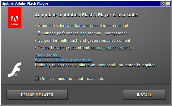
Upon booting my computer, an automatic Flash update tool notices that my installed version is out-of-date. (It’s no longer a good time to check for updates on boot; many people reboot very seldomly these days.)

Installation prompt #1

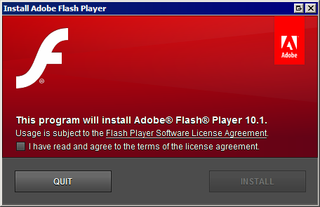
Clicking the “Install” button then shows:

Installation prompt #2

This is even worse on Vista or Windows 7 since they will require an additional UAC prompt. There are three prompts asking the user the same thing. When you ask someone a question, then ask again, “Are you sure?”, and yet again, “Are you really sure?”, some people are liable to change their minds.

I admit it’s unfair for me to complain about the UAC prompt since that’s outside of Adobe’s control, but their own, second installation prompt is simply goofy. Moreover, all the EULA nonsense gets in the way too. They should avoid introducing reasons for people to change their mind.

Thankfully, it does seem that Adobe again lets people download the Flash installer manually without using their silly Adobe Download Manager browser plug-in.

Connecting to Xbox Live should be easier

August 22, 2010 at 8:06 pm (PT) in Rants/Raves, Usability

So I finally bought an Xbox 360, pretty much just to see if Limbo is as good as I’ve been hearing. (My verdict is that is that it is a really good physics-based puzzle game, but it’s not mind-bending like Braid, which I like much better. And anyone who hasn’t played Braid yet must do so.)

Getting the Xbox 360 set up was surprisingly difficult. When I went to set up my new Xbox 360, I had the choice between creating a new “Gamertag” (a.k.a. a unique user name for their online Xbox Live service) or signing in using an existing one. I chose to create a new one, having completely forgotten that I had bought a Windows game last year that already associated a Gamertag with my existing Windows Live/MSDN account.

The Gamertag creation screen on the Xbox 360 asked me for an email address and a password so it could log-in to (or create) a Windows Live account. Entering the credentials to my Windows Live account showed an error message saying that my account already had a Gamertag associated with it, but it neither switched to it automatically nor told me what my existing Gamertag was. It instead suggested that I use a different Windows Live account. (Really? I need to use a different email address?)

Signing in with an existing Gamertag (which kind of confusingly is under “Recover Gamertag”) requires that I know my Gamertag first.

I went to a PC to log in to my Windows Live account to see if I could determine my Gamertag there. None of the account settings or information pages listed it. Eventually I stumbled onto the Xbox Live website itself, which (because I was still signed in to Windows Live) prominently showed my Gamertag.

  • Gamertag creation and Gamertag “recovery” should be merged into a single sign-in flow. It should ask for a Gamertag or an email address, each along with a password. It then should sign-in to an existing account or should create a new account if one doesn’t already exist. (The Xbox Live website already lets people sign in with an email address and a password; why doesn’t the console?) This also would avoid the misleading “Gamertag recovery” name.
  • Windows Live should make it easier to see Microsoft services associated with the account, and in this case, it should clearly indicate the account’s Gamertag in the account information screen.

At least it’s only a one-time pain, and admittedly most users wouldn’t run into that.

Why isn’t buying Wii points easier?

April 8, 2009 at 2:46 am (PT) in Rants/Raves, Usability

Downloadable games for the Wii are purchased through credit (“Wii Points”). Wii Points are purchased in the form of gift cards from retailers or are purchased directly through the Wii. The gift cards have a redemption code that must be entered on the Wii. Typing this in without a keyboard seems somewhat laborious. Purchasing points directly through the Wii requires entering a credit card number and some billing information. Typing this in is even more laborious. The gift cards therefore are a bit easier, but they lack instant gratification and seem physically wasteful.

I don’t understand why customers can’t make an account on Nintendo’s website, link their Wii with their web account, and then purchase Wii Points directly through the web. (Potential problems where people mistype their Wii ID number can be prevented by a simple two-step confirmation system.) You’d think Nintendo would want it to be even easier to separate customers from their money.

(Oh, I know I’m being a nitpicky pedant, but when buying points directly on the Wii, the confirmation screen confused me a bit. What am I answering “yes” or “no” to?)

Vilifying Visa

January 18, 2009 at 4:29 am (PT) in Rants/Raves, Usability

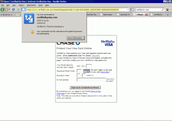
After submitting a credit card purchase at Newegg, I was greeted with a “Verified by Visa” webpage:
Verified by Visa screenshot

This page is idiotic.

  • I was directed to this page without any warning.
  • The page uses the domain verifiedbyvisa.com, not visa.com. A tip to financial institutions trying to thwart phishing scams: pick one domain name and stick with it. People are going to be directed to this page automatically, so the address does not need to be memorable or even human-readable. Using other domain names is confusing and looks suspicious, and if users become accustomed to it, it opens the door for phishers to use their own, look-alike domains (such as, say, verifiedbyvisacard.com, which is available as I write this).
  • For goodness’ sake, register your security certificate properly and completely. “Run by (unknown)” is not reassuring, nor is being verified by “Thawte Consulting”. (I’m sure Thawte Consulting is a big name in the security certificate space, but are they as recognizable as VeriSign? Besides, VeriSign acquired them 10 years ago. Again, pick one name and stick with it.)
  • The page provides me with none of my basic, personal information so that I can have some assurance of whom I’m dealing with. Verification is a two-way street. Continuing to ignore this makes phishing easier.
  • The page outright lies to me. The button says, “Sign up to complete purchase”, but Newegg already emailed me my purchase confirmation. I shouldn’t have to say this, but lying does not build up trust. Duh.

The uncanny valley of intelligent software

December 23, 2008 at 1:52 pm (PT) in Usability

There’s a phenomenon in robotics called the the uncanny valley. It’s also commonly used in the context of computer graphics, where cartoonish characters (e.g. The Incredibles) are more acceptable than those that aim for realism but fall short (e.g. The Polar Express, Beowulf). It’s also been used in the context of user interface look-and-feel. I think there’s an uncanny valley for “intelligent software” too.

Software is becoming increasingly complex, and it’s not uncommon for programs to provide knobs to control their behaviors. Providing too many knobs, however, can overwhelm a user with choices. Programs can combat this by providing fewer knobs and picking default settings appropriate for common use cases, and by trying to do more actions automatically for the user. They can go too far, however; programs that try to make too many decisions on their own become more mysterious, sometimes seeming unpredictable, out-of-control, and annoying.

The Microsoft Office Assistant (“Clippy”) seemed like a good idea at the time, but it was artificial intelligence gone awry. It tried to be smart to recognize when users needed help, but it wasn’t smart enough to know when it was unneeded or when its advice was off-base. Similarly, this is also one of the reasons why I hate Facebook’s “News Feed” (nee “Top Stories”). Facebook uses some unknown weighting algorithm to pick which items to show in what order, but it ends up seeming random; some items seem chronological, but some aren’t.

This is something we deal with at VMware; we provide a number of knobs to allow users to tune virtual machines for their needs. Some settings don’t make sense when used together though. At what point is this obvious, at what point do we take the easy way out and display a message explicitly explaining that enabling option X will disable option Y, and at what point does the message itself become an annoying obstacle?

I confess that I don’t know that it’s actually a valley, though; it could just as easily be a cliff. Are computers that act perfectly like humans really what we want? Humans often don’t do a good job of understanding what other humans want either.

Unsubscribing should be easy

September 20, 2007 at 9:30 pm (PT) in Usability

My mom has been receiving a lot of email from Borders. I don’t know why. Anyway, rather than setting email filters, I generally prefer attempting to unsubscribe from newsletters when they’re clearly backed by legitimate commercial entities (they are, after all, accountable and suable if things go wrong). Setting mail filters takes work, and I prefer stopping the email at the source over letting it clog the tubes.

Unfortunately, unsubscribing from Borders’ mailing lists is a challenge. Each email contains an “Unsubscribe” link at the bottom, but the link takes you to Borders’ website and requires you to log in to set your account’s email preferences. My mom says she has no account—and Borders’ website confirms that no account exists for the email address they’re sending email to—and therefore she can’t unsubscribe.

I eventually resorted to contacting their customer support. They said that they’ve removed her address, but we’ll see.

People running mailing lists should make unsubscribing really easy. There should be no hoops. Users shouldn’t have to remember log-in information. The easier it is for people to escape, the more willing they’ll be to try out the service in the first place. Annoying users who already are annoyed with you has no benefit. This doesn’t apply to just mailing lists. Netflix understands this and gets my business. Earthlink doesn’t, and I’ll never do business with them again, and I tell most people I know my Earthlink story so they will never do business with Earthlink either.

Things I don’t like about TomTom

January 20, 2007 at 3:40 pm (PT) in Rants/Raves, Reviews, Usability

For the Christmas before my dad passed away, I bought him a Bluetooth GPS receiver and the Palm OS version of TomTom Navigator for him to use with his Treo 650. I’ve started using it myself on my Treo during the past few weeks.

Things I don’t like:

  • TomTom’s restrictive copy “protection” scheme. Had I realized how draconian it is, I probably would never have bought their software. They require software activation, and the software can be activated at most twice. To show just how ridiculous their policies are, from their “I am having trouble activating a second hand TomTom Navigator” knowledge base article:

    Second hand TomTom Navigator products are likely to have already been activated once or more by the first buyer and the product code may therefore no longer be valid. For this reason we advise our customers not to purchase TomTom Navigator second hand. If you have already purchased a second hand TomTom Navigator product and cannot activate the software, we suggest you return it to the seller.

    In other words, they’re unwilling to help you, and you’re screwed. I’m somewhat tempted to call them to complain that the previous owner was my dad and that they’re a bunch of insensitive jerks.

    I downloaded a crack off the Internet instead.

  • Doesn’t automatically switch between day and night colors. The day colors are too bright at night, and the subdued day colors are too hard to see in the sunlight. At least hitting the “C” key quickly and easily switches between the two.

  • No verbosity control. The thing is a chatterbox sometimes, saying things such as, “Turn right, then turn left. Left turn ahead. Turn left.” within the span of seconds.

  • Some of its directions are misleading. TomTom often gives verbal directions like “turn right, then turn left” even though the left turn is a half mile away. I’d rather it didn’t mention the second turn at all until getting closer to it or if it said, “turn right, then stay in the left lane.”

  • Menus are permanently cluttered with buttons that require paid service. I have no intention of ever paying for traffic or weather service, but they’re always listed in the menu choices, and I’m forced to wade through them. Reducing options in a software application that might be used while driving (despite their warnings against it) would be good.

  • It uses strange defaults when restarted. When the software starts up and tires to retrieve the current location from the GPS receiver, it initially displays the “Home” location rather than from the last known location. It’s disorienting and weird. And once it does obtain the current location, TomTom Navigator always wastes time attempting to navigate to the last destination, even if you previously cleared the route or even if you already arrived there.

  • It doesn’t tell you the name of the street you’re currently on. Admittedly that’s not so important if you’re just blindly following the navigation directions, but it’s something I’d like to know.

  • It formats addresses as “Fake Street 123” instead of as “123 Fake Street”. There’s an option in the preferences to put house numbers first, but I can’t tell what it affects.

  • You can save addresses to a special “Favorites” list and give them meaningful names. For example, you can save “742 Evergreen Terrace” (er, “Evergreen Terrace 742”) as “The Simpsons’ house”. However, once aliased, you can’t retrieve the actual address. Want to tell someone else where “The Simpsons’ house” is? Too bad.

  • Incapable of learning. There’s no way to teach it about roads it’s not aware of, and worse, there’s no way to teach it about permanently blocked roads. Consequently, it will forever get the directions to my house wrong, because I live in a gated community, and TomTom (like most online mapping services) thinks there’s an accessible entrance into it where there isn’t.

  • Inconsistent time formats. When showing the amount of time to the next turn, sometimes it says “0:15 hrs” to mean 15 minutes. Sometimes it shows “9.50 min” to mean 9 minutes, 50 seconds. And yes, I told it to use U.S. formats.

  • Blinking speed indicator. If you choose to show your current speed, when the software thinks you’re speeding, it displays your speed in blinking red text. This is annoying because the speed limit can be higher than it thinks it is, the blinking red text is annoying and distracting, and because it’s blinking, by the time I look at it, the text is often gone.

  • Its “point-of-interest” system is hard to use. If you search for nearby businesses, the list of search results shows you how far away they are but not where they are. Selecting an item from the list automatically navigates to it rather than giving you more information first, and if the selected item turns out not to be the one you wanted, you need to perform the search all over again. Oh, and there is no point-of-interest category for supermarket/market/groceries.

That said, the TomTom Navigator software does look very nice and have a good feature-set, though I wish its features were more easily accessible.

As much as I like ING Direct, the 5% interest rate that some other places offer just seems too enticing over ING’s 4.35% interest rate, so I decided to switch.

I first tried to sign up for a savings account with Emigrant Direct, ING’s traditional competitor. I was very unimpressed with their website:

  • They use “intelligent” form fields that automatically advance to the next field when you fill up the current one. Although they’re not necessarily bad, Emigrant Direct’s implementation is broken. Making a typo in a field and triggering the automatic advancement has an enormous penalty:
    • Backspace doesn’t work in this model. The form fields automatically advance to the next field but have no automatic means to return to the previous field. The standard method for correcting typos consequently is crippled.
    • Shift+Tab is unusable. Not only is there no automatic way to return to the previous field, but the manual way doesn’t work either. Attempting to use Shift+Tab to return to the previous field retriggers automatic advancement, and you’re stranded where you started.

    Worse, since most of the “intelligent” fields are numeric, typos aren’t uncommon.

    Is it so hard to do this right? If you can’t make something smart, keep it stupid and consistent. Being only half-smart is dangerous.

    Also, the need for automatic advancement can be avoided by abandoning their overly structured form design where, for example, they make you enter your telephone number across three separate fields (area code, first three digits, last four digits) instead of using a single freeform field that they validate later.

  • Their session timeouts are too short. Although the online application process is spread over multiple web pages, the form on each page is somewhat lengthy, and they’re full of questions to which I don’t immediately know the answers. Unfortunately, if you spend more than a few minutes figuring out when you last moved or digging up your checkbook, your session times out and all the information that you entered is thrown away and wasted.

If Emigrant Direct wants to make it that troublesome to sign up for an account, it obviously doesn’t want my money, so I went elsewhere. I next tried signing up for Citibank’s e-Savings account. Citibank’s website also suffered from automatically advancing form fields, and at the end of the application process, it offers a confusing procedure to opt out of its mailing lists:

Citibank will periodically send information to you about new products and services … unless you check the box next to your name below. Information about your accounts will continue to be sent to you even if you check the box(es).

Citibank is allowed by law to share with its affiliates any information about its transactions or experiences with you. Please check the box next to your name if you do not want us to share among our affiliates any other information you provide to us….

Financial institutions that want people to trust them with their money should avoid such shady practices that obviously aren’t in the customer’s best interest:

  • It’s an opt-out system rather than an opt-in one. Lack of action grants permission. (“If you want me to eat them for you, please give me no sign.”)
  • Citibank uses negative instructions.
  • Citibank uses inconsistent wording; they use “unless” for one checkbox and use “if you do not” for the other.

I went with Citibank anyway. Sigh.