Why I hate Comic Sans
I admit that I hate Comic Sans partially as an attempt to be an elitist snob. Being on the bandwagon is amusing. But mostly I hate it because I think it’s an ugly font. It feels strange; it looks too mechanical to be mistaken for handwriting, but it’s not as neat, clean, and formal as a normal typewritten font. It’s in the uncanny valley of typefaces.
In an interview with The Wall Street Journal, its creator, Vincent Connare, said:
If you love it, you don’t know much about typography… if you hate it, you really don’t know much about typography, either, and you should get another hobby.
I’m only a wanna-be typographer and typophile, but I think Comic Sans doesn’t offend me as much as a typeface enthusiast as it does as a comic book reader. Connare designed it to mimic comic book lettering, but it doesn’t look like real lettering from comic books. Let’s look at some samples from some prolific comic book letterers:
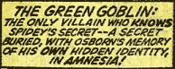
- Artie Simek (from The Amazing Spider-Man, volume 1, issue 121 (1973)):
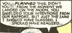
- Tom Orzechowski (from The Uncanny X-Men, volume 1, issue 137 (1980)):
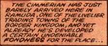
- Janice Chiang (from Conan the Barbarian, volume 1, issue 155 (1984)):
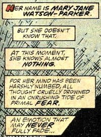
- Rick Parker (from The Amazing Spider-Man, volume 1, issue 300 (1988)):
And now compare to Comic Sans:
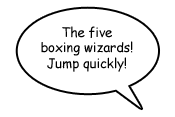
Even Dave Gibbons, the artist whose work from Watchmen partially inspired Comic Sans, calls it “a real mess”. An obvious difference is that normal comic book lettering uses only uppercase characters, making Comic Sans’s lowercase characters feel even more unnatural. Even uppercase Comic Sans doesn’t look much better, however.
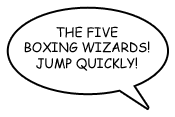
The weight is wrong; comic book lettering traditionally uses a heavier weight for legibility. Comic Sans’s bold variant looks a bit better, although I think it still looks a bit too mechanical.
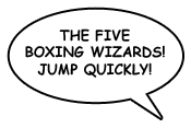
Comic book lettering often is slightly tilted (Tom Orzechowski’s work is a notable exception). I will concede that Comic Sans in all uppercase, bold, italics is not completely horrible. (Blasphemy, I know.)
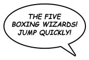
If only that were the default look.
4 Comments »
RSS feed for comments on this post.
hey, that’s a useful comparison. you’re right, the italiced all-caps version does look quite reasonable.
i also had forgotten you were such a comic book connoisseur.
what are you reading these days, i need something new.
i recently discovered Bendis and Oeming’s Powers (it’s a police procedural where regular detectives investiage superhero related crimes). It’s like Busiek’s Marvels but crossed with CSI. with batman the animated series stylized art, and a fair amount of (tasteful) sex. anyway, catching up with all 12 volumes of the trades has kept me busy for a while, but now i’ve finished and need somethig new.
— Ben @ December 14, 2009, 2:59 am (PT)
I haven’t been keeping up with the comic book scene, so I haven’t been reading anything new. The most recent things I’ve read were pretty trashy (both of them were Star Wars books; one was a somewhat interesting what-if story, the other one was The Force Unleashed, which I thought was awful).
Before that I finally bought and read all 1300 pages of Bone. My former office-mate got me to read American Born Chinese and recently has been trying to get me to read Fables.
— James @ December 14, 2009, 10:33 pm (PT)
Agreed! By the way, the ultimate comic book – understanding comics by scott mccloud.
— Rishi O. @ January 29, 2010, 12:40 pm (PT)
I’m sure by now you’ve seen http://www.comicsanscriminal.com/.
— Matt @ January 2, 2011, 7:35 pm (PT)