Ink doodles (2014–2018)

March 1, 2020 at 7:51 pm (PT) in Art

More ink doodles from 2014 through 2018. These were done with a Pilot G-2 0.38mm gel pen. While I like how I can make tiny writing with Pilot Hi-Tec C pens, I find the G-2 0.38mm pens to be more practical: they create lines fine enough for my taste, but they’re not so fine that I have issues with the tips clogging. It also helps that they’re easier to find in typical office supply stores and are cheaper.

I do like using ink, but I’m even more conservative drawing in it (i.e., I draw even more disembodied heads than usual). (Maybe someday I’ll get a knack for inking over pencil.) Beyond the typically similar content, I noticed that I unintentionally used much of the same layout in these two sheets for the placement of dragon heads, orc heads, smoke, and background practice.

Ink doodles (2014) thumbnail Ink doodles (2017) thumbnail

Whiteboard doodles

August 11, 2013 at 10:19 pm (PT) in Art

Various whiteboard doodles I made at VMware with dry-erase markers.

"Sheit Happens" thumbnail
2005. One of my coworkers was working on a project named “EIT” that got killed when some deal fell apart, and he asked me to scrawl this on his whiteboard. I’m not really sure why I bothered to sign this.

Ducks in danger thumbnail
2008. This started off with a magnetic stick figure holding some duck magnets, and my office-mate Christine and I gradually drew different things that he was rescuing them from. It’s hard to tell from the photo, but Christine attached wings to the back of the stick figure and crafted him a giant broadsword.

"Bye, cwu" thumbnail
2009. When my office-mate Christine (Wu) left to attend graduate school at CMU.

"Bye, Christian" thumbnail
2013. When my office-mate Christian left.

"Bye, David" thumbnail
2013. When my coworker David left. Christian and David left on the same day (they both left to focus on their startup). I made Christian’s first, and I was too tired afterward to spend much time on David’s (sorry, David). I made a lame attempt at jazzing it up a bit by adding a second color.

NaNoDrawMo 2012 doodles, part 2

November 30, 2012 at 1:56 pm (PT) in Art

The second half of my NaNoDrawMo 2012 doodles. This includes my first attempt at doing a realistic drawing in almost 9 years. I probably should just stick to lettering.

NaNoDrawMo 2012 doodles #2 thumbnail

NaNoDrawMo 2012 doodles, part 1

November 16, 2012 at 12:09 pm (PT) in Art

The NaNoDrawMo[ref]NaNoDrawMo is inspired by NaNoWriMo (“National Novel Writing Month”), but “National Novel Drawing Month” doesn’t make sense. Many people have instead backronymed it to mean “National November Drawing Month”, but that’s redundant.[/ref] challenge asks for 50 drawings in 30 days. Fortunately for me, the only requirement is quantity, not quality.

My original plan was to do 50 tiny drawings using the Pilot Hi-Tec C pen on a single side of 8.5″×11″ paper, but I decided that I wasn’t up to that challenge. I instead chose to use two sheets of paper with 25 pencil drawings on each.

Here’s my progress at the midway point:

NaNoDrawMo 2012 doodles #1 thumbnail

Ink doodles

August 16, 2012 at 8:00 pm (PT) in Art

I started drawing again a few months ago, this time using ink and no pencil, which is mostly new and unusual for me. A significant motivating factor probably was my usual, futile desire to eventually become good enough to impress someone who likely would never care anyway.

Ink doodles thumbnail

Done with a Pilot G-2 0.5mm gel pen. (I hadn’t yet acquired the impressive Pilot Hi-Tec-C pen that I kept reading about from various Kickstarter projects.)

I am a total narcissist

November 21, 2010 at 3:33 pm (PT) in Art

James Lin ambigram thumbnail

The “James” part is old, but somehow I didn’t make an ambigram of “Lin” before (although it also looks like “417”).

May 28, 2018 update:
I made an updated version that tries to make “Lin” look less like “Liin” and gave it a black background.

James Lin ambigram thumbnail

Why I hate Comic Sans

December 13, 2009 at 2:15 pm (PT) in Rants/Raves

I admit that I hate Comic Sans partially as an attempt to be an elitist snob. Being on the bandwagon is amusing. But mostly I hate it because I think it’s an ugly font. It feels strange; it looks too mechanical to be mistaken for handwriting, but it’s not as neat, clean, and formal as a normal typewritten font. It’s in the uncanny valley of typefaces.

In an interview with The Wall Street Journal, its creator, Vincent Connare, said:

If you love it, you don’t know much about typography… if you hate it, you really don’t know much about typography, either, and you should get another hobby.

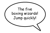
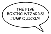
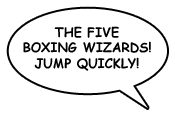
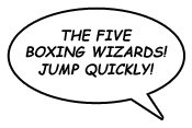
I’m only a wanna-be typographer and typophile, but I think Comic Sans doesn’t offend me as much as a typeface enthusiast as it does as a comic book reader. Connare designed it to mimic comic book lettering, but it doesn’t look like real lettering from comic books. Let’s look at some samples from some prolific comic book letterers:

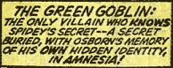
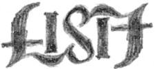
  • Artie Simek (from The Amazing Spider-Man, volume 1, issue 121 (1973)):
    Lettering sample by Artie Simek
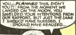
  • Tom Orzechowski (from The Uncanny X-Men, volume 1, issue 137 (1980)):
    Lettering sample by Tom Orzechowski
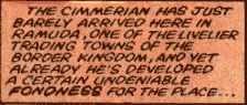
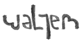
  • Janice Chiang (from Conan the Barbarian, volume 1, issue 155 (1984)):
    Lettering sample by Janice Chiang
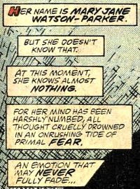
  • Rick Parker (from The Amazing Spider-Man, volume 1, issue 300 (1988)):
    Lettering sample by Rick Parker

And now compare to Comic Sans:

Comic Sans sample

Even Dave Gibbons, the artist whose work from Watchmen partially inspired Comic Sans, calls it “a real mess”. An obvious difference is that normal comic book lettering uses only uppercase characters, making Comic Sans’s lowercase characters feel even more unnatural. Even uppercase Comic Sans doesn’t look much better, however.

Comic Sans uppercase sample

The weight is wrong; comic book lettering traditionally uses a heavier weight for legibility. Comic Sans’s bold variant looks a bit better, although I think it still looks a bit too mechanical.

Comic Sans uppercase, bold sample

Comic book lettering often is slightly tilted (Tom Orzechowski’s work is a notable exception). I will concede that Comic Sans in all uppercase, bold, italics is not completely horrible. (Blasphemy, I know.)

Comic Sans uppercase, bold, italic sample

If only that were the default look.

E# umop apisdn

July 3, 2006 at 2:45 pm (PT) in Art

A couple more ambigrams:

2# umop apisdn

July 16, 2005 at 3:32 pm (PT) in Art

More ambigrams, this time of coworkers’ names:

  • Lisa
  • Walter
  • plangdale/alex. Philip Langdale (whose user ID is “plangdale”) and Alex share an office. Alex has the inner seat. (And thank goodness for Photoshop’s polar distortion filter.)

I’ve discovered that John Langdon is releasing a second edition of his WordPlay book which has a new section about how to create ambigrams. I’m slightly annoyed since I already own the first edition, and it’s signed and personalized, so I can’t exactly sell it or give it away. Well, at least my first edition is a hardcover.

The Many Depictions of Suckitude

April 10, 2005 at 10:24 pm (PT) in Art

A themed collection of various pencil doodlings:

(Don’t forget to scroll to the right.)

I am feeling better than I was a few weeks ago, though.