Adobe Flash installer goofiness

November 24, 2010 at 10:38 pm (PT) in Rants/Raves, Usability

In recent years, Adobe Flash has been a prime target for malicious hackers in which to find security exploits. (Don’t even get me started on the security vulnerability of the week in Adobe Reader.) Additionally, in the era of the zombie PC apocalypse, compromised computers hurt everybody.

It’s therefore crucial that users update Flash on their systems to patch known exploits, yet Adobe strangely makes it harder than necessary to update Flash.

Upon booting my computer, an automatic Flash update tool notices that my installed version is out-of-date. (It’s no longer a good time to check for updates on boot; many people reboot very seldomly these days.)
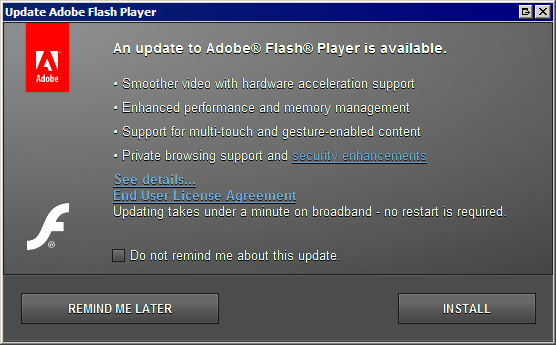
Installation prompt #1

Clicking the “Install” button then shows:
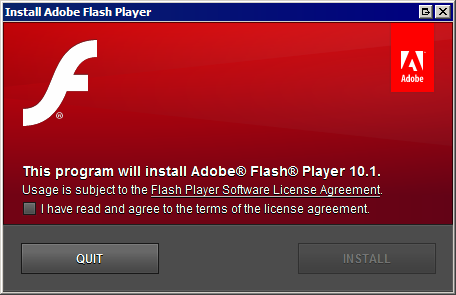
Installation prompt #2

This is even worse on Vista or Windows 7 since they will require an additional UAC prompt. There are three prompts asking the user the same thing. When you ask someone a question, then ask again, “Are you sure?”, and yet again, “Are you really sure?”, some people are liable to change their minds.

I admit it’s unfair for me to complain about the UAC prompt since that’s outside of Adobe’s control, but their own, second installation prompt is simply goofy. Moreover, all the EULA nonsense gets in the way too. They should avoid introducing reasons for people to change their mind.

Thankfully, it does seem that Adobe again lets people download the Flash installer manually without using their silly Adobe Download Manager browser plug-in.

I am a total narcissist

November 21, 2010 at 3:33 pm (PT) in Art

James Lin ambigram thumbnail

The “James” part is old, but somehow I didn’t make an ambigram of “Lin” before (although it also looks like “417”).

May 28, 2018 update:
I made an updated version that tries to make “Lin” look less like “Liin” and gave it a black background.

James Lin ambigram thumbnail

We are software engineering divas

November 20, 2010 at 2:05 am (PT) in Personal

Yesterday everyone in VMware R&D was invited to a company holiday party. The invitation read: “If you are attending the party, you will be allowed to leave work at 3:00 in order to get to the party on time.” A lot of us were slightly insulted by the wording. (The company’s privileged to have us working there, right?)

Impressions of the Watchmen movie

September 11, 2010 at 2:16 pm (PT) in Reviews

I finally got around to watching the Watchmen movie. (Yeah, I know I’m late to the party. I meant to watch it in theaters, but my plans fell through, and by then everyone else had seen it already.) I have to agree with Ben’s remarks: I liked it, but I didn’t love it.

Even in the director’s cut, a lot of things from the comics were omitted, but that’s to be expected. I was a bit disappointed that some things were left out (mostly involving Rorschach’s origin). I was skeptical that Watchmen would work as a film—a lot of what makes Watchmen great is how it takes advantage of the comics medium. The movie adapts it as well as probably can be expected; it does an admirable job, but by itself I think it falls a bit flat. It’s too late to be groundbreaking, and I think familiarity with the comics is necessary to appreciate the movie.

(Spoilers below.)

(more…)

Connecting to Xbox Live should be easier

August 22, 2010 at 8:06 pm (PT) in Rants/Raves, Usability

So I finally bought an Xbox 360, pretty much just to see if Limbo is as good as I’ve been hearing. (My verdict is that is that it is a really good physics-based puzzle game, but it’s not mind-bending like Braid, which I like much better. And anyone who hasn’t played Braid yet must do so.)

Getting the Xbox 360 set up was surprisingly difficult. When I went to set up my new Xbox 360, I had the choice between creating a new “Gamertag” (a.k.a. a unique user name for their online Xbox Live service) or signing in using an existing one. I chose to create a new one, having completely forgotten that I had bought a Windows game last year that already associated a Gamertag with my existing Windows Live/MSDN account.

The Gamertag creation screen on the Xbox 360 asked me for an email address and a password so it could log-in to (or create) a Windows Live account. Entering the credentials to my Windows Live account showed an error message saying that my account already had a Gamertag associated with it, but it neither switched to it automatically nor told me what my existing Gamertag was. It instead suggested that I use a different Windows Live account. (Really? I need to use a different email address?)

Signing in with an existing Gamertag (which kind of confusingly is under “Recover Gamertag”) requires that I know my Gamertag first.

I went to a PC to log in to my Windows Live account to see if I could determine my Gamertag there. None of the account settings or information pages listed it. Eventually I stumbled onto the Xbox Live website itself, which (because I was still signed in to Windows Live) prominently showed my Gamertag.

  • Gamertag creation and Gamertag “recovery” should be merged into a single sign-in flow. It should ask for a Gamertag or an email address, each along with a password. It then should sign-in to an existing account or should create a new account if one doesn’t already exist. (The Xbox Live website already lets people sign in with an email address and a password; why doesn’t the console?) This also would avoid the misleading “Gamertag recovery” name.
  • Windows Live should make it easier to see Microsoft services associated with the account, and in this case, it should clearly indicate the account’s Gamertag in the account information screen.

At least it’s only a one-time pain, and admittedly most users wouldn’t run into that.

Wallet pens

January 17, 2010 at 3:18 pm (PT) in General, Rants/Raves

One of things I lamented when I replaced my Treo with a Pre was that since the Pre uses a capacitive touchscreen, it doesn’t use a stylus, so I no longer had my Treo’s combination stylus/ballpoint pen wherever I went. There have been numerous times where the pen came in handy, and after I switched to the Pre, there have been numerous times where I’ve found myself not having a pen when I needed one. I’ve been looking for a good wallet pen as a substitute but haven’t found anything appealing:

  • The Wallet Pen—the one recommended by Oprah—is $50 (a 3-pack costs a staggering $125). I think Oprah must be one of the few people who thinks it’s affordable. If I put that in my wallet, it’d be the most valuable thing in it.
  • The Derringer Pen is much cheaper at $8 (a 5-pack costs $32), although that still seems expensive to my inner miser.
  • The FoldzFlat pen is a cheap plastic pen for $2 (or $25 for a stainless version) that folds into the form factor of a thick credit card. This is the right price, but my wallet has enough credit card-sized things in it already.

Last week the obvious occurred to me: I could carry the stylus/pen from my Treo in my wallet. Duh. It’s thin, it has a sturdy metal barrel, and it even has a cap. It doesn’t have a clip, but I think that’s okay since a clip would add to the bulk. I think it’s thinner than either the Wallet Pen or the Derringer pen. It fits easily but snugly into the bill compartment of my wallet.

Thumbnail of combination stylus/pen

The price is reasonable: it’s effectively free for me since I bought a 3-pack of them years ago, but normally a 3-pack costs around $10–15. It’s a third-party accessory, and there are various companies that produce and sell different versions for different PDAs, so it’s possible to shop around too.

Avatar impressions

January 1, 2010 at 9:20 pm (PT) in Rants/Raves, Reviews

I saw Avatar in 3-D on New Year’s Eve with a bunch of my cousins. Impressions (spoilers ahead):

(more…)

Why I hate Comic Sans

December 13, 2009 at 2:15 pm (PT) in Rants/Raves

I admit that I hate Comic Sans partially as an attempt to be an elitist snob. Being on the bandwagon is amusing. But mostly I hate it because I think it’s an ugly font. It feels strange; it looks too mechanical to be mistaken for handwriting, but it’s not as neat, clean, and formal as a normal typewritten font. It’s in the uncanny valley of typefaces.

In an interview with The Wall Street Journal, its creator, Vincent Connare, said:

If you love it, you don’t know much about typography… if you hate it, you really don’t know much about typography, either, and you should get another hobby.

I’m only a wanna-be typographer and typophile, but I think Comic Sans doesn’t offend me as much as a typeface enthusiast as it does as a comic book reader. Connare designed it to mimic comic book lettering, but it doesn’t look like real lettering from comic books. Let’s look at some samples from some prolific comic book letterers:

  • Artie Simek (from The Amazing Spider-Man, volume 1, issue 121 (1973)):
    Lettering sample by Artie Simek
  • Tom Orzechowski (from The Uncanny X-Men, volume 1, issue 137 (1980)):
    Lettering sample by Tom Orzechowski
  • Janice Chiang (from Conan the Barbarian, volume 1, issue 155 (1984)):
    Lettering sample by Janice Chiang
  • Rick Parker (from The Amazing Spider-Man, volume 1, issue 300 (1988)):
    Lettering sample by Rick Parker

And now compare to Comic Sans:

Comic Sans sample

Even Dave Gibbons, the artist whose work from Watchmen partially inspired Comic Sans, calls it “a real mess”. An obvious difference is that normal comic book lettering uses only uppercase characters, making Comic Sans’s lowercase characters feel even more unnatural. Even uppercase Comic Sans doesn’t look much better, however.

Comic Sans uppercase sample

The weight is wrong; comic book lettering traditionally uses a heavier weight for legibility. Comic Sans’s bold variant looks a bit better, although I think it still looks a bit too mechanical.

Comic Sans uppercase, bold sample

Comic book lettering often is slightly tilted (Tom Orzechowski’s work is a notable exception). I will concede that Comic Sans in all uppercase, bold, italics is not completely horrible. (Blasphemy, I know.)

Comic Sans uppercase, bold, italic sample

If only that were the default look.

Chelmsford in the news

December 5, 2009 at 12:12 pm (PT) in General

Oh, Chelmsford. Cheap attempts to get national recognition through Fox News by equating Santa to Nazis aren’t what I want my childhood hometown known for, although I do commend the application of Godwin’s Law.

Can’t we follow Futurama’s lead by making Christmas non-religious and renaming it to Xmas? (Preferably with fewer murderous robots.)

Crappy PDA doodles

December 5, 2009 at 12:00 am (PT) in Art

Doodles I drew on various Sony CLIÉ handhelds from 2001–2003. Like all other Palm OS devices, they used resistive touchscreens that lacked any kind of pressure-sensitivity, and the digitizers in the touchscreens were somewhat noisy, so hand-drawn lines ended up with a shaky appearance.

I made the first image with TealPaint (which at the time supported only the traditional Palm OS resolution of 160×160 and not the 320×320 resolution of the CLIÉ devices). I made the rest with MemoRu!.

  • Troll (2001-05-31)
    Troll
  • Demon (unfinished) (2002-03-03)
    Demon (unfinished)
  • Heathcliff (2001-12-02)
    Heathcliff
  • Dragon head (2001-12-04)
    Dragon head
  • Ant man (2001-12-02)
    Ant man
  • Fat baby (2003-03-24)
    Fat baby